OakNorth
New Brand Platform
The brief was for a new Brand Platform and Identity which captured the spirit of the brand to date but looked to the future with the idea that diversification and entrepreneurialism would again play a bigger part in the identity, it has to inspire and compliment their reinvigorated approach to products and services kicking off in 2023.
October 2023 Creative Director, Product Design Director, Squad Lead – OakNorth, London
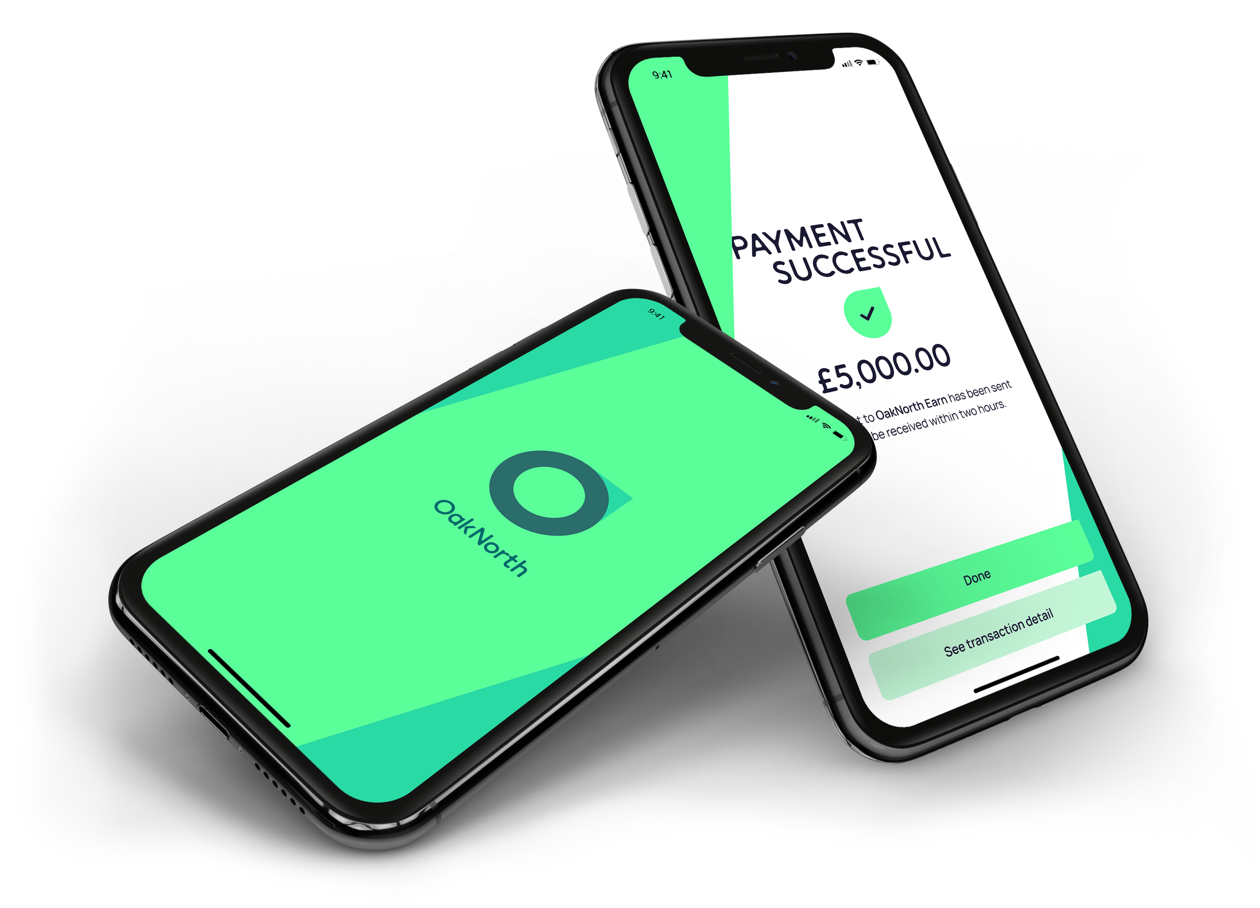
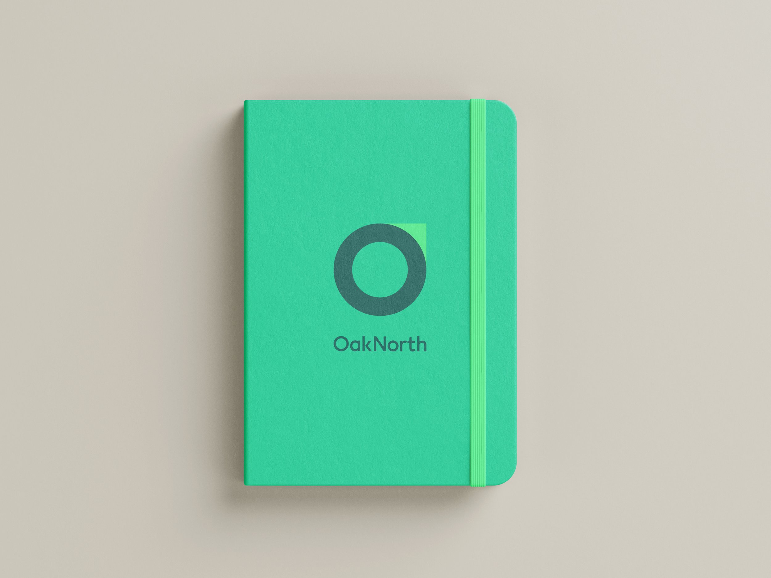
OakNorth’s new logo is elegant and simple.
The O and the N of the name are combined as an acronym, but more importantly they are the combined ideas of the two words.
The circle is an O but it’s also the seed and protective shell of the Acorn which promises protection and growth. It also represents the rings of the mighty oak as it grows in strength and resilience.
Then there’s the N which provides guidance and hope represented by the compass baring, giving purpose and direction to what is an otherwise directionless shape.
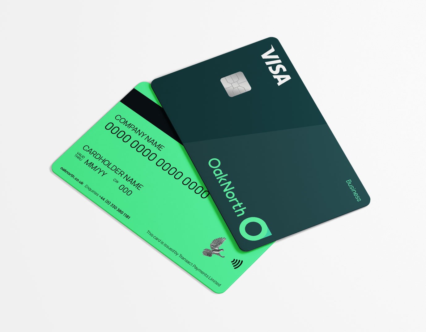
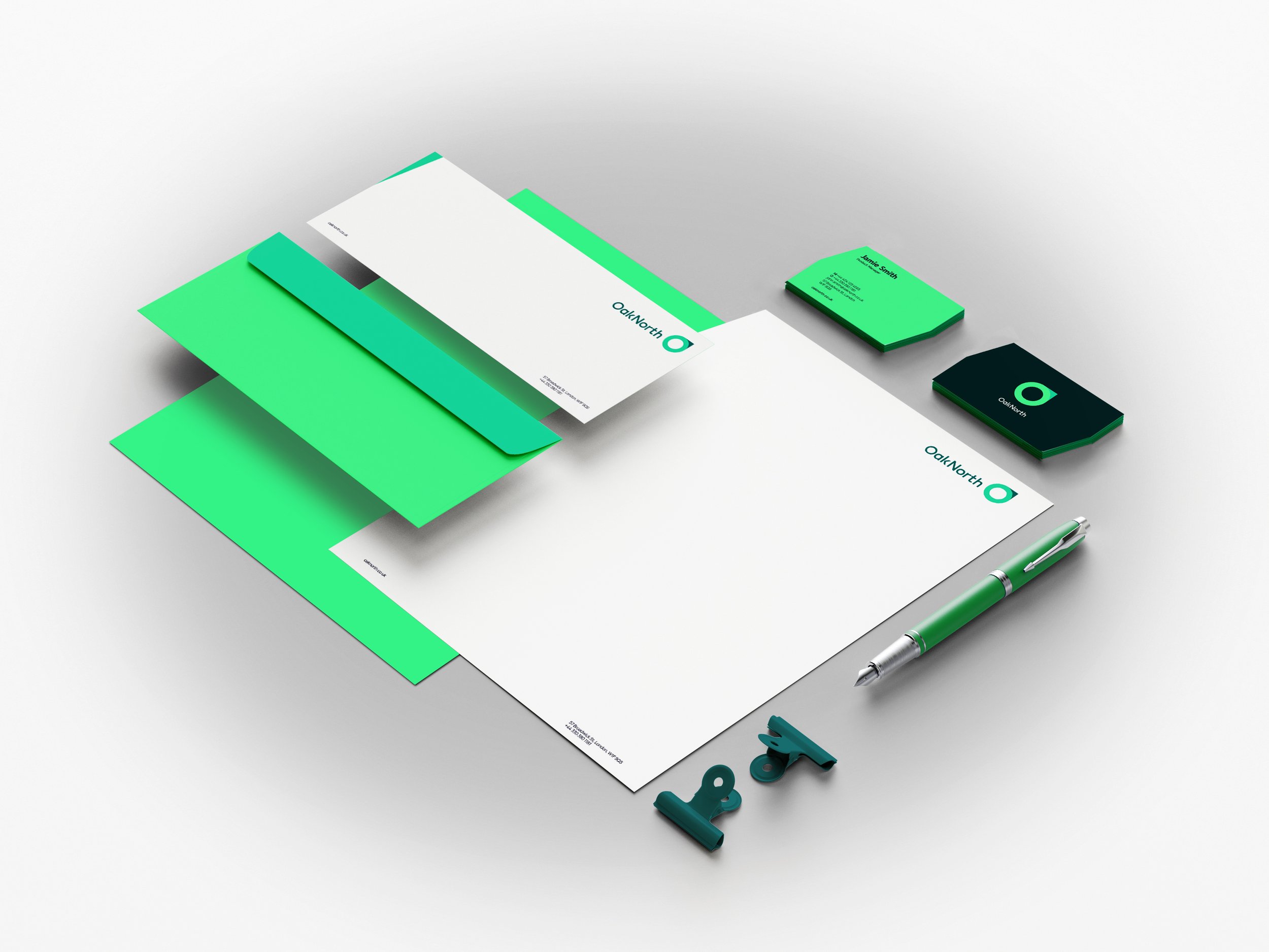
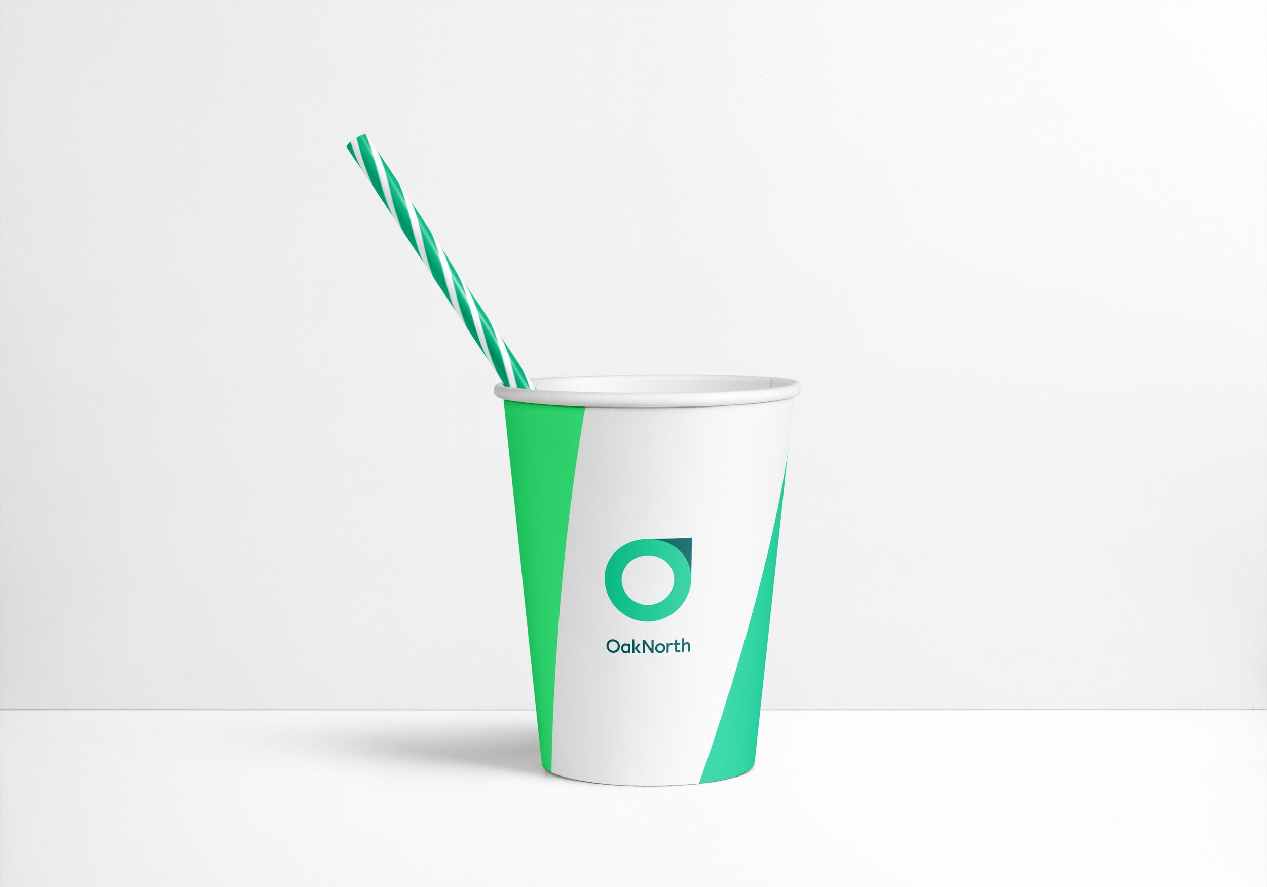
The punchy colours indicate a digital first company that is green first and foremost with 3 secondary colours for distinction.